Search for agent website examples and you get fifty screenshots of the same template: a stock skyline, a search bar, a headline that says “Your Dream Home Awaits.” None of it tells a buyer why they should call you.
The sites that work share four things. A photo-led hero, so the first impression is a place rather than a slogan. One clear promise — who you help, where, and what they get. Proof, in the form of listings, numbers or client quotes. And an enquiry path that reaches the agent in minutes, not a brokerage queue that gets around to it on Monday. Everything below is measured against those four.
Six looks, one $39 product
Every SiteCurb template is a genuinely different design, not a color swap. All six are included at $39 a month flat — no setup fee, no IDX fee, 14-day free trial — and each one below links to a live demo you can click around.
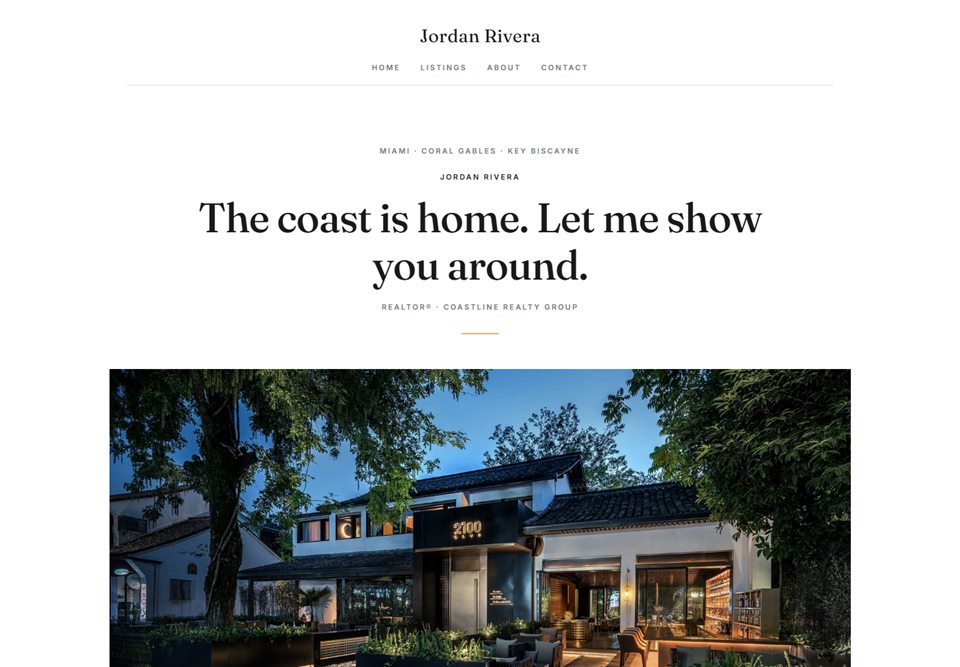
01 · Timeless
Classic
A centered serif masthead over an editorial grid — the layout newspapers and magazines have relied on for a century, because it never dates. Your name goes where a masthead goes, and the listings fall into clean columns beneath it.
Suits established agents and referral-driven businesses — anyone whose brand is their own surname and who wants a site that still looks right in five years.
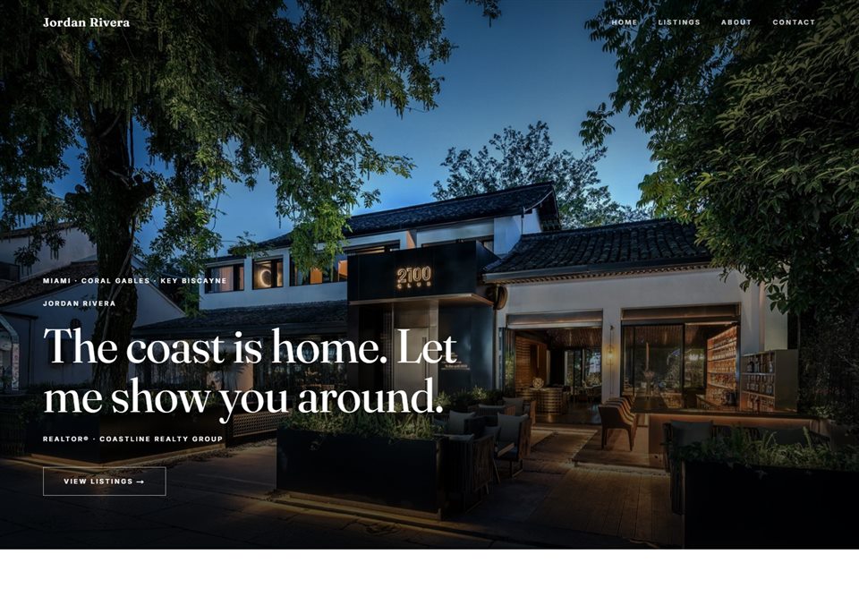
02 · Dark and cinematic
Modern
A full-screen photo hero with the serif headline set low in the frame, then a boxless listing grid in the Hilton & Hyland mold — no cards, no borders, just the photograph and a line of specs. It is the look of the top luxury sites, and it depends on one great hero shot.
Suits agents with strong listing photography, in markets where restraint reads as confidence.
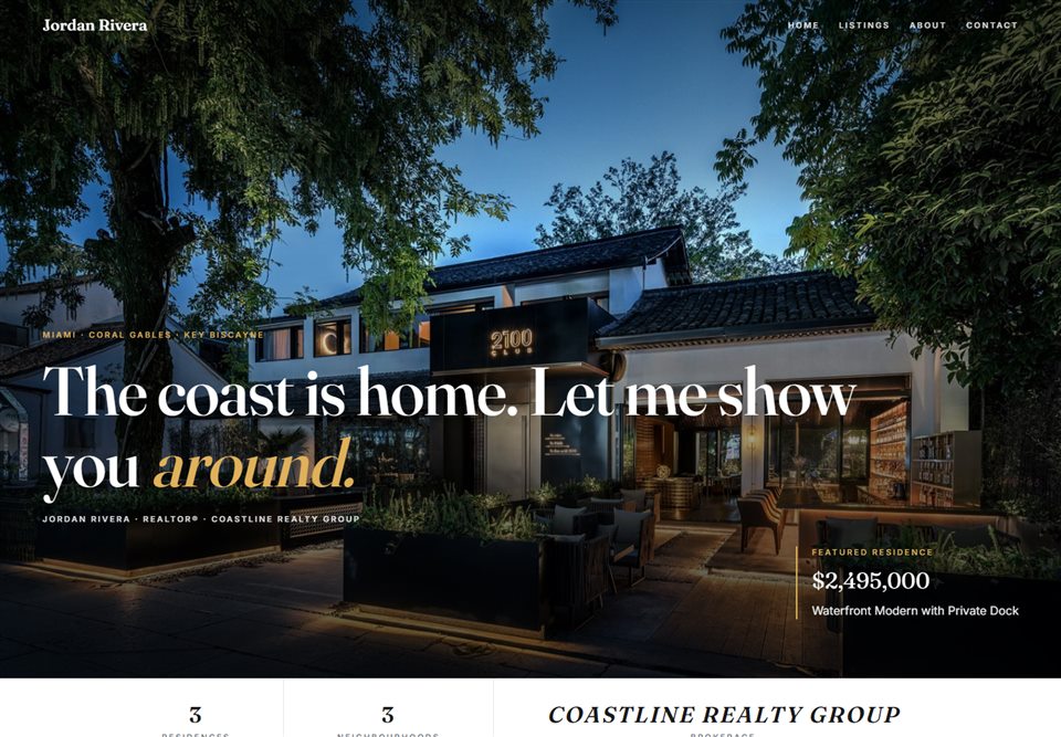
03 · Quiet luxury
Estate
Hairline rules, a serif face, a cinematic hero, then why-me columns and client quotes doing the persuading. Nothing shouts; the whitespace does the work.
Suits high-end and estate agents, and anyone selling to buyers who distrust anything that looks like a billboard.
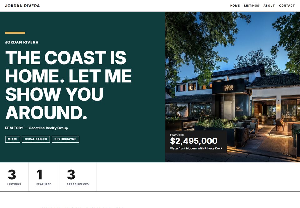
04 · Urban
Metro
Poster type, hard color blocks, a sharp 2px grid and a stats strip up front — sold this year, days on market, years in the business. Built to be read at a glance, on a phone, in a hurry.
Suits city agents and condo specialists who want energy rather than hush.
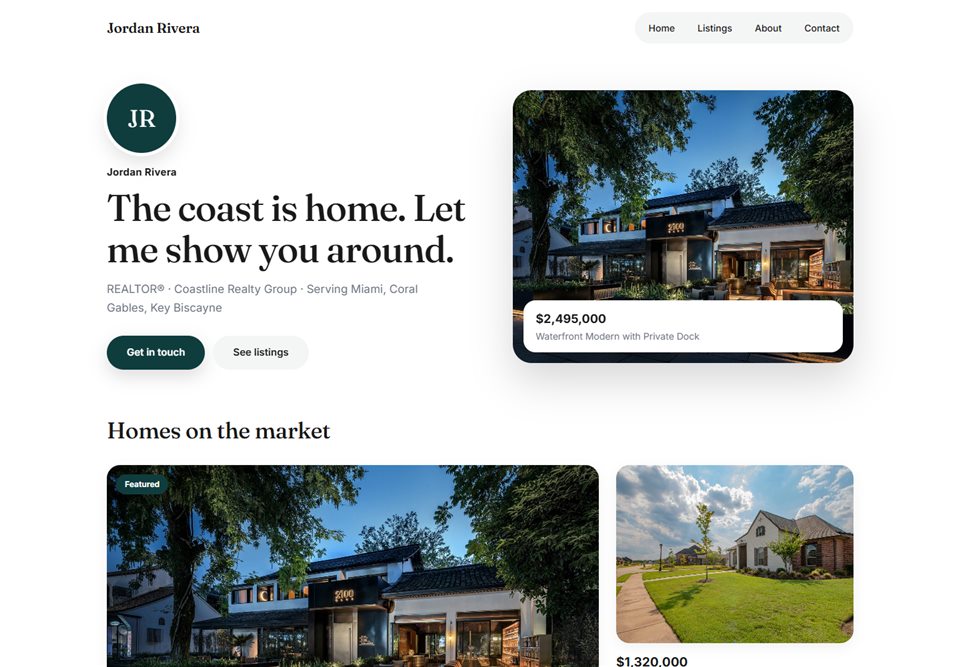
05 · Family and suburban
Harbor
A warm split hero with a floating listing card, rounded photo cards that lift on hover, soft corners everywhere. It reads as friendly before a word is read.
Suits family and suburban agents, first-time-buyer specialists, and small teams with a neighborhood focus.
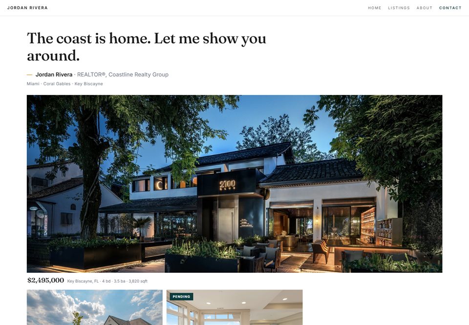
06 · Photo-first
Gallery
Minimal to the point of near-invisible chrome. A large-format grid carries the page, and the price reveals on hover. Your photography is the design.
Suits agents whose listings photograph beautifully — waterfront, mountain, architectural — and who would rather show than tell.
Build the whole site free. You only pay when you publish — and switching templates later is one click.
What the best in the business do
Five sites from the top of the market, credited by name. Each one makes a specific move worth understanding — and each move has a version a solo agent can borrow without a $7,000 build.
Reference
The move. A full-bleed video hero with one serif line sitting low in the frame, a nav set in wide-tracked capitals, and a listing grid with no boxes at all — just the photograph and pipe-separated specs beneath it.
What to borrow. You do not need the video. One excellent still, one short line, and specs written as text instead of icon rows gets you most of the way. That is what the Modern template is built around.
Reference
The move. A bold sans-serif headline, a search box as the first thing on the page, and rounded region cards for each market the firm covers. It is a brokerage site, so search-first makes sense for them.
What to borrow. The region cards. A solo agent can show three neighborhoods with a photo each and a sentence on why they know it. That is local proof, and it is what buyers actually search for.
Reference
The move. Dark sections carrying press logos as social proof. The band does one job: tell a stranger that other people already trust these agents.
What to borrow. The pattern, not the logos. A dark band with three or four things a stranger can verify — years licensed, an award, a local paper that quoted you, a designation. Put it where the press logos would go.
Reference
The move. An oversized press quote set on black. One line, a credited source, and the whole section stops the scroll.
What to borrow. One great client quote, set big, on a dark ground, with a first name and a neighborhood under it. The Estate template gives client quotes exactly this kind of room.
Reference
The move. A signature-script logo over serif capitals — the personal brand treated as a luxury brand — and a lead-capture modal that appears the moment you land.
What to borrow. The brand cue is cheap: a handwritten name over a serif heading. Skip the modal — on a solo agent's site it pushes people away before they have seen a listing. Put the capture further down, after the proof. SiteCurb's “get new listings first” block sits exactly there.
The anatomy of a site that gets enquiries
Design is the price of admission; this is what converts. Nine things, in the order a buyer meets them.
- 1
Photo-led hero
One great photograph — a listing, a street, or you — not a stock skyline.
- 2
One-sentence promise
Who you help, where, and what they get. If it needs a second sentence, it is not a promise yet.
- 3
Your areas up top
The neighborhoods you actually work, named before the fold. Buyers search by place, not by agent.
- 4
Three reasons to choose you
Not “integrity” and “passion.” Specifics: years, a niche, a result.
- 5
Real client quotes
Names, neighborhoods, a sentence in their own words. Three is plenty.
- 6
Listings with prices visible
Hiding the price costs you the click. Show the number.
- 7
An enquiry form on every listing
One that emails you the moment it is sent — not a brokerage queue. Every SiteCurb listing has one.
- 8
Broker disclosure
Your brokerage name and license where it is required. It builds trust and keeps you compliant; SiteCurb puts it in the footer.
- 9
Fast on phones
Most buyers meet you on a phone in a driveway. SiteCurb templates are built to a 100/100 PageSpeed target.
Have all nine by tonight.Pick a look, add your listings, preview the draft, publish to your own address. $39 a month, everything included, cancel anytime.
Start your siteQuestions people ask
Do I need professional photos?
For your listings, yes — every template on this page leans on photography, and a phone photo of a living room reads as exactly that. For your own portrait, a good phone shot in daylight is fine. If you only budget for one thing, budget for the hero photo.
Should my site have IDX search?
Only if your business depends on showing the whole MLS inventory on your own site. For most solo agents it adds monthly fees and per-MLS agreements without adding enquiries — buyers already search on the portals. SiteCurb sites show your own listings with your own photos, so there is no IDX fee and nothing to license.
How many pages does an agent website need?
Four or five: a home page that does the selling, a page about you, your listings, your areas, and a contact path. More pages do not bring more enquiries — a clearer home page does.
Can I switch templates later?
Yes — one click, and your content moves with you. Listings, photos, bio and colors carry over, so you can try all six looks before you decide.